Crafting Plugin Interfaces: Where Design Meets Music Creation
March 3, 2025Ever opened a VST plugin and thought, “Wow, this looks amazing!“ Or maybe you’ve struggled with a confusing interface that made you want to throw your mouse across the room?
The way a plugin looks and feels makes a huge difference in how we use it. A great GUI (Graphical User Interface) isn’t just about looking pretty. It’s about making the user experience (UX) smooth, intuitive, and even inspiring.
So, how do you design a killer VST GUI? Let’s break it down and analyze Cloudmax Breeze in the process!
Step 1: Start with a Clear Vision 🎯
Before diving into design, ask yourself:
- What’s the purpose of this plugin? (Is it a synth, an effect, a mixing tool?)
- Who’s going to use it? (Producers, sound designers, beginners?)
- What makes it special? (What’s the unique selling point?)
Your answers will guide everything from layout choices to color schemes.
For example, a complex modular synth aimed at sound designers might have a futuristic, intricate layout, while a simple compressor should feel sleek and professional with an easy-to-read interface.
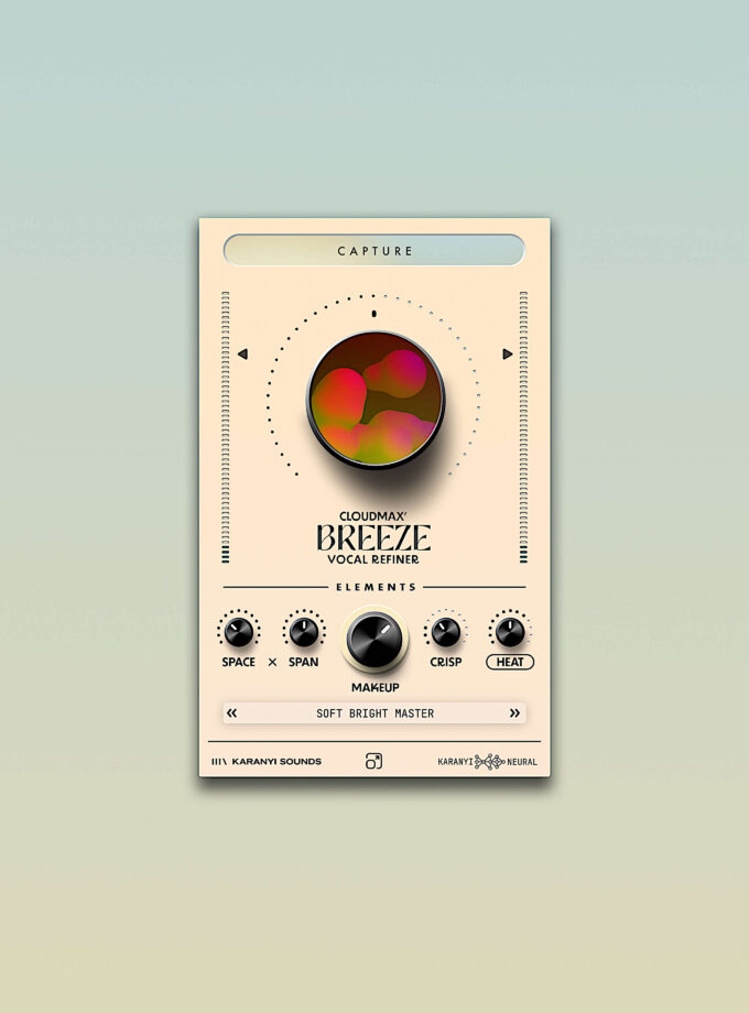
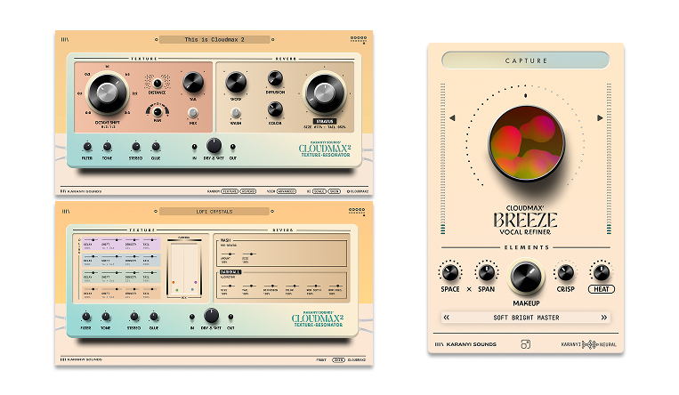
💡 Real-World Example: Cloudmax Breeze
Cloudmax Breeze is a vocal refiner, meaning its primary function is to polish and enhance vocals with ease. The design reflects this goal with an ultra-clean, minimalistic layout.
- Instead of overwhelming users with too many controls, it prioritizes essential elements like Space, Span, Crisp, and Heat.
- The interface is inviting and accessible, making it easy for both beginners and pros to get great results without a learning curve.
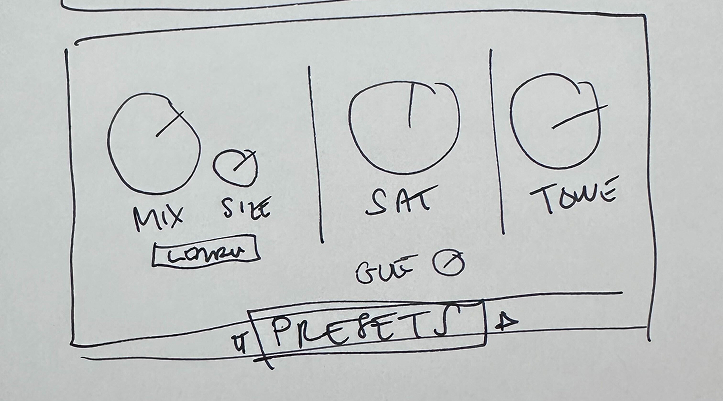
Step 2: Sketch It Out ✏️
Think of this step as doodling ideas on a napkin before jumping into development.
Ask yourself:
✅ Where should the knobs, sliders, and buttons go?
✅ What’s the most important feature, and how do we highlight it?
✅ Can users understand the interface without reading a manual? (If not, simplify!)
A well-designed GUI is like a well-organized studio: everything should be within reach, and nothing should feel out of place.
🎛 Cloudmax Breeze’s Layout Choices
Breeze’s layout follows a clear visual hierarchy:
- The large central knob dominates the interface, signaling its primary function.
- The visual animation inside the knob makes interaction feel responsive and alive.
- Secondary controls (Space, Span, Crisp, Heat) are arranged logically below the Elements sign, ensuring a smooth workflow.
This intuitive design means users immediately understand how the plugin works, reducing the need for manuals or tutorials.
Step 3: Make It Look Awesome (But Keep It Functional) 🎨
Now for the fun part: choosing the visual style!
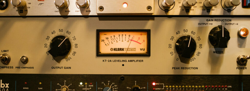
- Skeuomorphic Design 🛠 → Mimics real-world hardware (like vintage synths with wood panels and glowing VU meters).
- Flat & Modern Design 🖥 → Clean, minimal, and sharp (think Ableton Live’s sleek look).
No matter the style, the key is clarity—users should instantly know what each control does.
🎨 Cloudmax Breeze’s Visual Design
Breeze follows a semi-skeuomorphic approach with a modern hybrid aesthetic:
✅ Knobs have realistic shadows & dimension, making them easy to recognize.
✅ Clean, minimal design keeps the UI uncluttered while maintaining depth.
✅ Subtle gradients and dot indicators add visual feedback without overcomplicating the interface.
🎨 Color Scheme Choices & Psychology:
- Warm beige background → Creates a comfortable environment.
- Black knobs → Provide strong contrast for easy visibility.
- Subtle green indicators → Add visual interest without distraction.
💡 Why This Matters: Colors influence usability! A high-contrast interface helps in low-light studio environments, while a neutral palette reduces eye strain during long sessions.
Plus, in this case we wanted to pay homage to Cloudmax 2:
Step 4: Smooth User Experience (UX) = Happy Producers 😊
A beautiful design means nothing if it’s frustrating to use. Keep these UX principles in mind:
✅ Simplicity Wins – Avoid clutter. Only include essential controls.
✅ Consistency is Key – Fonts, buttons, and sliders should follow the same visual language.
✅ Instant Feedback – Turning a knob? Give users a visual cue (color change, numbers, animations).
✅ Accessibility Matters – High contrast, clear fonts, and scalable UI elements help all users.
✅ Performance is King – A great GUI should be smooth and responsive, not sluggish and CPU-heavy.
💡 Cloudmax Breeze’s UX Advantages:
- Large, easy-to-read labels prevent confusion.
- Knobs & sliders provide visual feedback, ensuring intuitive adjustments.
- Animations inside the central knob make interactions engaging and responsive.
Step 5: Test, Improve, Repeat 🔄
Great VST design is an iterative process, and Cloudmax Breeze is no exception.
The plugin went through multiple design iterations, refining its GUI based on real user feedback.
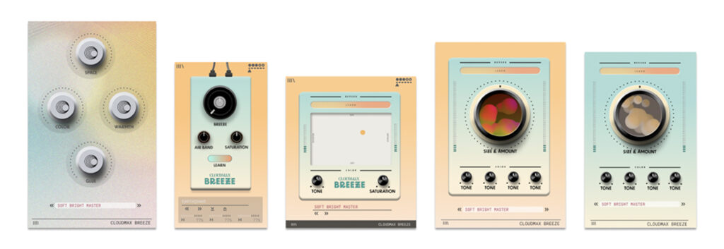
- Early versions had different control placements and color schemes.
- Through rigorous testing, the interface evolved into its current sleek & intuitive form.
💡 Key Takeaway: Watch real users interact with your plugin! If they struggle, tweak the design. Small changes in knob placement, labeling, or UI contrast can make a huge difference in usability.
Final Thoughts: Make It Fun & Functional 🎶
Your VST plugin’s GUI isn’t just a pretty face—it’s the bridge between the user and the sound.
A well-designed interface should be:
✔ Intuitive (No manual needed)
✔ Aesthetic (Inspires creativity)
✔ Functional (No distractions or unnecessary elements)
Cloudmax Breeze shows how a thoughtful interface can make music production feel effortless and fun—while a bad one can frustrate users and kill creativity.
💡 Pro Tip: Keep your design simple, clear, and engaging—because music is fun, and your plugin should be too! 🎛 🎶